Laval Scimitar
[Melee] [Dragonfire Peaks]


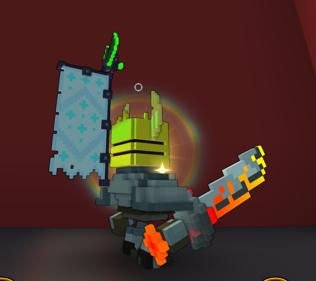
Enter: the Laval Scimitar! This hunk of might carries a droplet of THE SUN in a specially strong, magical glass on the bottom of the handle to power the firepower of the sword.
As the sun courses its heat through the handle to the tip of the blade, the fire actually shows along the edge of the blade, glowing in heat because even this specially magical metal isn't strong enough to conceal ALL the heat of the sun.
Of course, most of the magic was concentrated into the handle to keep the heat from leaking there so our heroes don't lose their hand just trying to hold it... Will this magic hold the fire and flames forever? We best hope so...
This'll be the last version of this sword - the requirements have dumbed it down too far/too much, that I'd rather just drop this design, unless there's another requirement issue besides "uniqueness".
Progress
Status
Created 5 years ago
Updated 2 years ago
The author of this Creation has been Rewarded by the Trove Developers.
Laval Scimitar status has been set to Added
![]() ActualPostCard 2 years ago
ActualPostCard 2 years ago
Laval Scimitar status has been set to Rewarded
![]() ActualPostCard 2 years ago
ActualPostCard 2 years ago
Laval Scimitar status has been set to Accepted
![]() ActualPostCard 2 years ago
ActualPostCard 2 years ago
Laval Scimitar status has been set to Approved
![]() Ylva 5 years ago
Ylva 5 years ago
Laval Scimitar status has been set to Needs Review
![]() Banipal 5 years ago
Banipal 5 years ago
Laval Scimitar status has been set to Active
![]() Ylva 5 years ago
Ylva 5 years ago
Laval Scimitar status has been set to Needs Review
![]() Banipal 5 years ago
Banipal 5 years ago
Laval Scimitar status has been set to Active
![]() Ylva 5 years ago
Ylva 5 years ago
Laval Scimitar status has been set to Needs Review
![]() Banipal 5 years ago
Banipal 5 years ago
Laval Scimitar status has been set to Active
![]() Ylva 5 years ago
Ylva 5 years ago
Laval Scimitar status has been set to Needs Review
![]() Banipal 5 years ago
Banipal 5 years ago
Laval Scimitar status has been set to Active
![]() Ylva 5 years ago
Ylva 5 years ago
Laval Scimitar status has been set to Needs Review
![]() Banipal 5 years ago
Banipal 5 years ago
You must be logged in to add a comment.
Hi! That is entirely up to Dev team. From time to time they accept Creations and Mods, depending on what they need for the game. Unfortunately i have no idea when that might happen, but since the last acceptance wave was a really long time ago i am hoping for it to happen again some time soon. I can not promise or say anything for sure though, sorry.
@![]() Ylva
Ylva
Yeah, I meant for it to be named "laval", as in it's a "lava-type" sword. Ships that are of the navy, are "naval" because they're "navy-type"ships . I also just thought "lava scimitar" was too shallow/generic. Also, thanks with the file name - I'll keep that in mind for next time. Thank you.
Hello again!
Thank you for fixing last bits. Was a long and bumpy road but im happy i can approve it now. Well done!
Thank you for uploading the blueprint too, for future reference please name them styletype_stylename[CreatorsName].blueprint to match file naming in Trove. In your case its sword_lava_scimitar[Banipal].blueprint . I renamed it for you this time so i wont have to set you to Active again. Its meant to be lava_scimitar, right? Not laval_scimitar? Let me know if lava_ is wrong.
Hoping to see more creations from you!
Hello again!
So sorry for the delay.
To be clear, your design was unique and attractive from the start, the shape and dimensions were an issue. No matter how pretty things are im not allowed to approve anything that goes outside of the dimensions box.
There is a slight material mapping issue going on, you have some dark-red voxels near the grip mapped both Glowing and Metal, it can only be one of those at a time. Glowing on Type = rough on Specular. Metal on Specular = plain white on Type. (blue circle)

Also you are using 255.0.0 RBG (glowing Type map color) on some voxels in main QB. It might cause issues when converting to blueprint so its best to use slightly different shade, 255.20.20 for example will look almost identical but will never cause any issues.
Plus it could be good to have more than one color in the visible part of the pommel.
Hoping i will be able to Approve it next time i see it on Review.
Hello again!
I see sword getting further and further from the original design with every fix :P I really liked the line of fire on the very edge, was looking very clean and elegant, but i suppose there is a charm to current design aswell.
About the pommel once again. You reduced the side but it still does not fit in the box... i know there are lots of sword designs that have huge pommels but we have these restrictions now exactly because of them.
May be it would be alright with you if pommel didnt have glass at all? Removing that and coloring it into same fiery colors as on the edge (instead of plain red) doesnt look all too bad. Design i tried (sword on the bottom of image) still goes outside of the dimension box (black stick with AP in the middle) but i suppose if there is absolutely no other way to make your idea work i could approve something like that. It would be risky and could prevent Devs from Accepting it though so i highly recommend you try some design that completely fits in.

As a thought, the sword seems to be losing quite a lot of uniqueness as we try to fit it in the boundaries. May be you could catch some wild inspiration to add some spark to the design?
I honestly wish i could approve every good sword without trying to push its limits but it is the most 'done' category of styles and there is a huge chance that Dev team would prefer to accept an 'ok' Fist over 'quite good' Sword.
Going to set status to Active for now, hoping you can make this one work.
Hello again!
Sorry for the delay.
Good job on the hand guard, it doesnt seem to get in the way anymore :) I like the slightly yellow-er blade edge too, really gives the 'heat' impression!
Although it doesnt look like you did anything about the pommel getting into the ground.

Please make sure there are no more than 3-4 (preferably 3) voxels behind the Attachment Point. There is an image in my previous comment comparing allowed dimensions and your sword dimensions. Those restrictions exist to make sure that all animations on all classes wielding that weapon will look good. In other words, that bounding box of space would not cross the body or be positioned in any 'unnatural' way but everything that gets out of the box most likely will.
I understand the idea and design of swords comes out of that pommel, but may be you could manage to shrink it down to both keep the idea and fit in dimensions?
Hello!
You sword design looks fun, i especially like the colors and shape of the blade, very bright and attractive!
However the design of other bits would need to be adjusted. I understand the idea, but even on your screenshot that pommel goes into the ground. All swords need to fit in 9x9x35 around the attachment point (pink voxel that tells the game where to place the weapon). Also there has to be enough room for a hand/arm to be placed (yellow rectangle), again, on your screenshot you can see that part of guard going into knights shoulder.
 Really hope you can manage to adjust the shape but keep the looks unique. Im sure you heard about amount of swords Trove already has :P
Going to set status of your creation to Active, change it back to Needs Review if you upload updated model. If you d rather create something completely new, set status of this one to Draft, that will free up a creation slot for another style.
In any case, good luck!