I'd like to start collecting more regular feedback from our loyal users about what you would like to see improved.
Even though I appreciate it when people say everything is perfect and I don't need to change anything, I do like to have some direction on what to work on, instead of my own personal task lists.
Let me know in the comments about what you would like to see us improve or add to the site for a chance to receive a ![]() The Dev Dream box.
The Dev Dream box.
Task
- Write a comment on this page with feedback about what features should be improved or added on the Trovesaurus site
Dates
- Tuesday, June 25, 2019 to Tuesday, July 9, 2019
Rewards
- Based on participation numbers around 10 people will receive 1x
 The Dev Dream
Example
- The most pressing issue for me when I visit the site is the loading time of the homepage, I would like to see that improved.
- I would like to see more club builds listed and easier to browse, perhaps with larger pictures and tags for categories.
Being specific really helps.
Results
The following random users have received a reward for their participation.
You must be logged in to add a comment.
Great site , could be inproved by putting more specific navigation tabs at the top , and re-stock the gunsliger costume codes if possible, keep up the hard work :D
eu gosto do site mas gostaria de ver informações sobre gemas dos uber mais fortes como o uber 8 é shadow pra cima entendeu?
I love the class guides that people make on here, but it feels like a lot of info is missing most of the time, where are the gems stats? which sub-class should I be choosing? I dont know if its because people leave that information out but I feel it would be a great addition to have.
Amazing website!
One I love your website, but I’d think the daily reset, weekly reset and Luxion’s timers should be at the top of the page!
thanks!
This site is very interesting because you can have free frames! But a little bemile I have trouble sometimes to find the code ducoup it should be highlighted more thank you for everything
Great site, would also be nice to have maybe a tracker on the main page that showed the current and upcoming weekly bonuses (star bar, xp, fast invasions, bonus reroll). I love the information break-downs available on major patches and events.
i just find this website evry nice beacause your giving away free mounts and more and just guys don t change your nice
This site is pretty clean to follow the information of trove , they give a good giveway , Well the only 1 thing i need is a night mod ^^
the giveaway thing kinda overshadows the rest of the website, rather than shoving it down your throat it should be just on the home page and no where else
The mobile ads are a bit large. Covers nearly half the screen. Maybe cut them down to standard banner ads?
I'm using the auto ads feature from Google, which tries to automatically place ads in the best place. I've noticed some weird placements myself which removes the sidebar and things, but I think apart from that it is a better system than the PC only ads we used before on the old ad network. But you are right, it can be a bit disruptive and so I need to investigate if I can do anything about that.
Beacuse im not the best in English speech or Text , i would like only 1 idea to be added..
A lot of "Us" Young players are very tired and lazy.. to read a lot of text, (True) .
Example: Update "Going Green" V
Would it be possible to add some "Voice Button"(In Selected Category) so it automaticly play the recorded voice that sombody made / programmed.or Just to Link You-Tube link'ed videos which speak only about that update.
I didn't wanna sound rude in any of this Text. If you felt annoyed or disrespected i really apologize.
Thank you for your feedback.
Walls of text are something I am aware of, and for a lot of these sections we provided pictures to provide an overview of the section to help with that. Although you bring up a valid point about perhaps linking related videos, it's not videos we would ourselves produce but hopefully others in the community.
A text to speech button likely isn't something we would provide though.
I think u guys should make the tabs and codes and stuff better accessible for mobile because I dont have a laptop and my phone is kinds small so it's hard to see on it and could you add notifications too know if you won the giveaway or not and you u guys should also make an app!
Do you have any examples where the stuff doesn't work well on mobiles? I've tried to make them usable on both.
Notifications should be sent out if you win a giveaway.
Also creating an app I'm not sure I can justify the time invested on that, or how much it would be used vs the website. But it is still an option if I am looking for something to learn personally.
The issue for me it's that the site background sometimes doesn't change and I've been trying for a bit but it would be nice and would like to see like cornerstone builds and etc.
What do you mean the site background doesn't change? By default the background will show Peaceful Hills, to change it you need to edit your profile.
Although another feature is that if you visit someone elses profile page, you will see the background they have hcosen.
As for more builds, I agree.
Took a while to find the site, not sure why but it doesn't pop up early when "trove wiki" is googled. Might want to check the SEO?
Awesome site though!
You are right that it isn't optimised for the Trove Wiki keyword at all, because mostly I make a point that this isn't a wiki, it's a database powered by the Trove client. The Trove Wiki is another entity entirely that is powered by people entering data themselves. And they have the domain and optimisations from a full company to promote their pages.
I'm pretty proud in how Trovesaurus has developed over the years to be recognised, with mostly just the work of a few fans.
I would of course love for the site to feature better in search results though.
The only problem I have is the mobile site is a little difficult to navigate but at least it's manageable
good fan built website but i do think it should be a little bit easier to navigate to where there are giveaways for codes and other such things.
Thank you for the feedback, do you have any suggestions which would make it easier to navigate to where the giveaways and codes are? It has a large section at the bottom of the homepage already.
I really love how you guys post tips for beginners. The one thing I'd recommend is making it known to everyone, maybe on the trove site, because personally, it took me quite some time to find this helpful site.
Thank you for the recommendation, advertising isn't really something I'm too comfortable doing. I did used to be active on the Trove Forums but it can get a bit weird self promoting and sometimes being engaged in discussions with people of differing opinions.
The site has mostly survived on just being discoverable, and most serious players do find us due to the exclusive mounts they can claim, the giveaways, the art contests, the place to submit mods.
However I admit there is a large amount of people that I'm not engaging, which I would love to do better. I'm just not sure how to go about doing that, or what use they would have, veteran players already know the information here, I could perhaps incentivise guide making again, we haven't done things like that in a while.
That feature is mostly phased out, you can still generate them probably with /link at the end of your profile URL. However there isn't a lot of additional functionality you get with that, if you use Trove Tools you will get Trovesaurus Mail notifications and it used to display on your profile when you were in-game. We didn't develop additional functionality around that so it wasn't really included in the profile page redesign.
After all the the changes I've seen nothing but improvements from this website.
In the rewards page (where you can spend your reward tokens in) there should be a ability to seperate the game platforms rewards (the rewards of each platform if it's in stock) so users won't have to open each reward information box hoping to see that their platform's reward stock isn't out.
A other idea I have is a reward code refund feature where the user who had already chose the reward can be able to return the reward, like typing it in a textbox and then the website will see if it existed in the rewards area, this can also be applied to the giveaways but slightly different as instead of returning the code, it regives the code to a other user that didn't had the chance to win the giveaways (Although this can go get thrown off a window becuase users can give the rewards by simply giving the code to a friend).
Thank you so much for reading this! Have a nice day. :)
Thank you for your feedback.
You are right that an indication should probably be given for platform availability would be nice, as it prevents the need to click.
As for code returns, I really can't offer that, as I can't trust that the code is unused, people could claim, then return. It is a nice idea though, but I don't see a way we can do that safely.
I think it's a really great community and very well made. I would like it to be easier to search for mods and such, just cause it is strictly a keyword only search thingy, so that would be much appreciated. Over all great site!
Thank you, do you have any suggestions as to how to make it easier to find mods? You can browse by type and subtype from the mods page, or see the most popular.
I was thinking like filters, so you can search for things like file type, what the mod replaces and such.
I really like how this place is set up, but I agree with that we need a build section with categories I would 100% love that!!! xD .... and maybe a really good video instructions on how to mod because for the life of me I can't seem to figure it out even with all the steps written out.
Thank you for your requests. I would like to re-work the club builds section, so it's nice to hear that others want it too. For modding videos I don't create content, and I'm not sure if anyone else creates that type of content at the moment, but I would like to make a better written version on the site to start people on modding.
Oh, it's my favorite site about trove and it's so great that you improve it. I dunno what to say, may be my thought will come to me later, but now I would like to upload my own avatar.
That's a feature for the Trovesaurus Gold users, the aim is to have the majority of users chose models from the game to work on a consistant style.
I really like the site in its current state. It works well, makes sense, and is monitored heavily. Things get added pretty fast after they get into Trove itself.
I think we could do with a bit more mobile accessibility, such as the ability to change button size or just fiddle with how stuff looks more. These however would just be quality of life, and the site would be fine without them.
Thank you, I do try to pay attention to mobile concerns, and one of the benefits of using the bootstrap styling is that they are supported. Some things do require manual tweaks so if you have a specific concern on a mobile I could look at that.
I personally think that the site is amazing as is, but I'm also a person that thinks that everything can improve, like the ability to change the size of certain things, such as the buttons for us sausage fingered people.
A thing I noticed was that from other videos on YouTube of streamers, I saw older versions of this site, and saw them access stuff, tabs, that I don't know how to access on the current site. Or if it didn't exist anymore, I don't know how to obtain information that alerts me to this kind of stuff. Maybe should be introduced at the start.
Maybe including it at the start, right after making an account for the site, like a video outlining the website or the changes that had occurred over the years of its development. Of course the video still has to be accessible to people after they are finished with it, and you can update that video anytime you want. In the outline video maybe include if there are still codes for the sageosaurus, spaceosaurus, tomb raider costume, as that could be a way of promoting the site, as well as that was how I was introduced to the site.
That is out of my hands as a site developer, either these are provided by modders who have had their items accepted or the Trove team.
Some of the icons in this site take longer to load up
then sometimes it will not finish
it will be a half icon
"(it's a great site BTW)"
-----------------------------------------------
Some Beautiful Screenshots of mine:
suggestive text in the searchbar would be nice for when I can't remember the exact name of an item
Yeah suggestive text would be nice, I will see what I can do, we used to offer this not sure why it was removed, maybe performance reasons.
It would be cool to have a mod designer in trovesaurus for us console players just to get our ideas out there
I'm not sure what you are asking but if you just mean a place for console users to suggest ideas for modders to create, you can use the Trovesaurus Discord #modders channel perhaps
i would like to have a "wiki" page for each item in the game and how to obtain it.
i would like a more width content page, half of the screen is occupied by the background image
There are pages for every item in the game, and where we have information we list how to obtain it. If you are looking for some specific information on an item you can let us know about it, and we can work on completing it for you. Or if you have information how an item is obtained you can submit a correction to a page using the sidebar.
You raise a valid point about removing the container to increase the visible area, we did run a test where we stripped out the container, it makes things a little weird on super large screens so it hasn't graduated testing yet.
You can test this for yourself with:
https://trovesaurus.com/?container-test=hide
To undo the test and return to normal use:
What i was missing the most (and still am), is that no item has a section about the possibilities where to get these items. For example Dragon eggs. I would like to see a section where a specific item is (or was) obtainable.
Well each dragon egg and fragment should have its own page which has the information, if the page is missing the information I'd like to know about it. I was working on an overview page for all of them which you might be meaning.
Perhaps an option to enable or disable which notifications you can see under the Notifications Tab? For example: Having the ability to disable notifications that show up whenever someone likes your art.
Yes this is a good point, the ability to turn notifications off or send to email is a customization option I would like to add to the profiles.
I just stumbled upon this little issue. I saw the "pin recipe button" under certain items. For example, I wanted to add Big Bomb to a list to save for later. Sadly, it didn't do anything and this is what I was stuck with:

I couldn't edit or do anything. I could only click "Remove recipe"
Suggestion to actually make the "pin recipe" feature work as intended, or allow to make a list of saved items for later.
Small request: Add a "clear all" button to notifications. A batch of contributions can take over a minute to X individual contributions
One of the things that is difficult to manage with Trove as a newer player is the abundance of older information and trying to parse through it to find what is useful. For instance, many builds are a couple years old and without checking what has changed between then and now it's hard to know if that information is relevant. Would it be possible to have a tag on builds labeling them as "currently viable"?
If there is already I system utilized to purge out-dated information I apologize for overlooking it.
-Its hard to find Skulls or Bosses inside geode 5-star dungeon because its so hugh and have so little time to find it.
-Need a map to show all the way/where to find this objectives and which kind of it , and maybe other dungeon map on other biome.
Due to the random nature of dungeons this wouldn't be something that would work for a guide on the site, what you are suggesting would have to be included in-game I think.
You should add a level system and mini games for the site so it has not just updates of has a bit of fun.
It is not very accurate what has to improve and a great site but sometimes I get lost on the information of the items you could improve the site and great
Do you have any suggestions about how I can improve the information of items so that you don't get lost? What parts do you get lost on?
I've actually been working on improving the information flow of item pages, most notably lately the "How to Obtain" field section.
I woud like to see more information added to the items in Trovesaurus, to make it easier for players to quickly gather information on whatever item they're searching up voor.
That's a bit generic and there isnt really something specific I can look at for this. Would you like to suggest which items need additional information?
I would like to see more information added to the items listed in Trovesaurus, to make it easier for players to quickly gather information on whatever item they’re searching up. For example, recently, I searched up the tome: Writings of Wonder. I knew that this item existed, and I knew what it does, but I couldn’t for the life of me figure out how to obtain it. I think that updating the information on some of the items will go a long way in helping those of us that rely on Trovesaurus!
Also, on a side note, I’ve noticed that the “Upcoming” tab on the calendar doesn’t show anything. Maybe this could also be fixed?
I would also like to see more information added to items, this is done manually and requires users to call out to us when things are missing or needs updates. There is a way for users who are logged in to submit corrections to pages which are one of the ways to earn Reward Tokens. I could also bring back the feature which lets people more easily report information that is missing that they are looking for.
As for no items on the Upcoming Calendar that isn't a bug that needs fixing, I just haven't added any future events at the moment. Perhaps I should indicate this.
For Writings of Wonder, I started to write some information on this and then the internet went down and I lost it. From the information I could find it seemed that this item used to be available in Troves of Wonder and Chaos Chests and once appeared on Luxion. Nothing recent shows this as available at the moment but I could investigate some more.
Maybe ability to link PSN account and maybe other integrations like twitter, youtube, twitch, tumblr, etc, maybe also badges and/or user titles and milestones if there not on here already <3
Does PSN / XBOX have online profile pages you can link? or would a field for gamer tags or something be the best way to do that?
Also we used to have badges but took them out. Old old page https://trovesaurus.com/badges I'm not sure how to present that was a more inviting way to work towards things and display them.
No theres no PSN ID linking or typing field on this website, linking like battle.net and bungie.net or enmasse.com and truetrophies.com does or at least typing PSN ID in a PSN ID field to display like my Trove forum account, Twitter, and Discord, maybe add more to Display aswell like YouTube/Twitch/etc eventually be cool features and arigatou gozaimasu for badges part thank you :)
My biggest issue as a returning alpha player was finding accurate info in boxes. As in for ex. I could not find a list of rewards from bomber season 2 chests it could be my navigation but last time I was at the page there wasn't any info. I would also like to see some of the guide updates to the current year. Class builds etc. But I believe those are community driven.
Thank you for the feedback, the info in boxes is a new feature we released a few days ago, can you check back now and see if you can find the info you need.
Guides and builds I would love to have updated but as you say that is community creation, I spend most of my time creating the platform for people create that kind of content. However what I could do is either sponsor some content either targeted to individuals or to incentivise a contest.
I'd like cuter themes for the website that are more Trove themed rather than the simple black and white colors etc.
on giveaways you should give items that get to the point people use, like a good badge, a costume, flasks, and so on, if the person needs mastery. she herself has to turn around so she can not wait for giveways. Oh, I'm waiting for my tombstone tempest costume for hihihi gs
For giveaways we can only really rely on the generosity of Modders who donate codes for us to give away their accepted items, we can't pick and choose what we give away unfortunately.
A way to search through clubs more easily? Or maybe some way to add tags to clubs meant for a more social purpose, so people with similar interests can find said clubs (ie if I was someone interested in cars and I want other people interested in cars to find my club). I'm sure there's clubs with this information in their descriptions, but as far as I can tell there's no option currently for the searchbar to find&display that info, and there's no option to search ONLY clubs.
(which could be another thing to add---searches where you can pick only a certain category to search in)
Thank you for the feedback, the request is reasonable although would require engaging the club leaders to set this, which may be a bit of a challenge.
However I could look at whether the site search feature checks the description of clubs, which might help in what you are looking for.
I'm not sure what exactly you are referring to for searching only in a specific category, if that is related to the site search then you can use the tabs that appear on the search results page?
Edit: I can confirm that the site search does check the club name and description for matches.
by searching only in a specific category i mean either going to a page (clubs, users, etc) and being able to search ONLY in that category, instead of the searchbar defaulting to showing you all results in all categories. sort of in the way you'd be able to search on a forum (though i guess implementing those functions into the main toolbar in the first place may be easier?). something like this: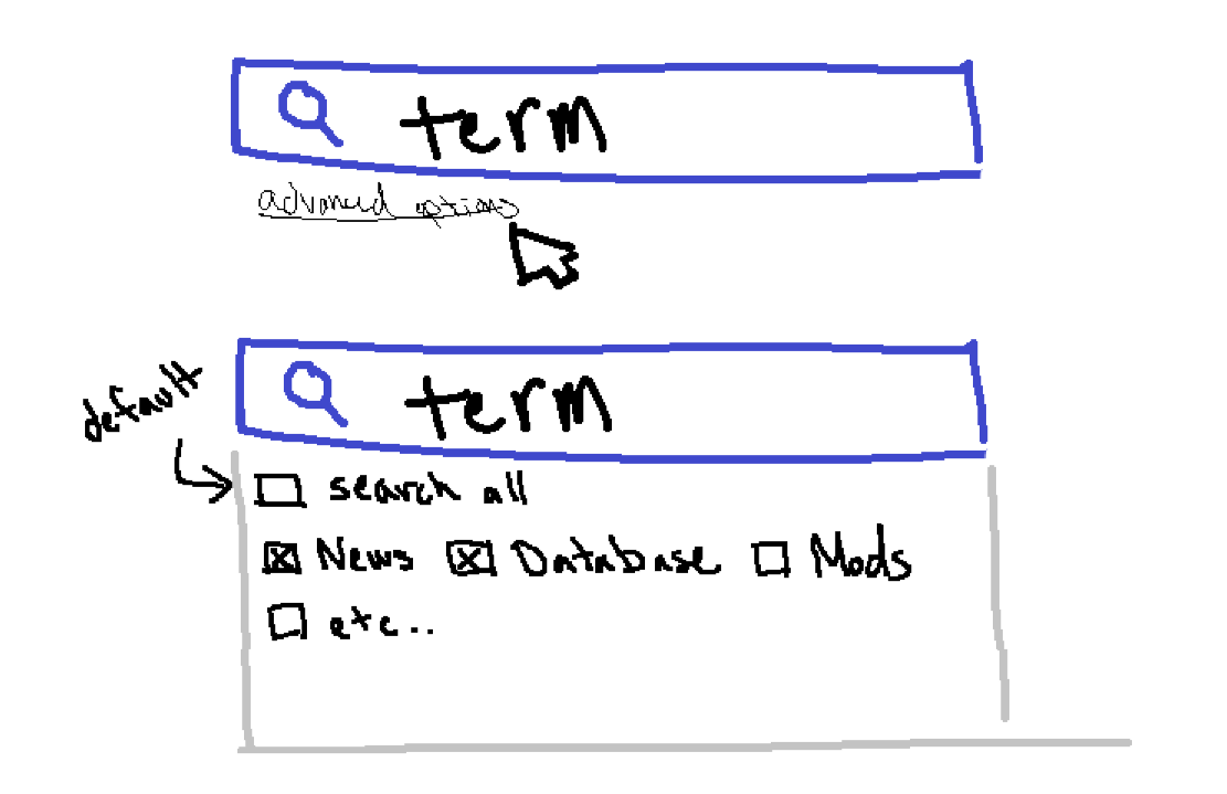
while the description search works, it only seems to work sometimes? if its a word thats only in the description of my group, it defaults to the 'google' tab and shows only my group as a result. but if its a more common word like 'art', under the 'google' tab it shows EVERYTHING with art in the title or the description in whatever order google chooses, and only groups with 'art' in their name under the 'clubs' tab (picture of this below).
i especially feel this would be improved by the addition of some sort of tag system? now that i've also looked through some other club descriptions---for clubs focusing on making pixel art or making music tracks, it'd make it infinitely easier to find them by searching something along the lines of 'Clubs> music, art' than searching music or art separately and only getting clubs that have 'music' or 'art' in their names, and 300 google pages to scroll through.
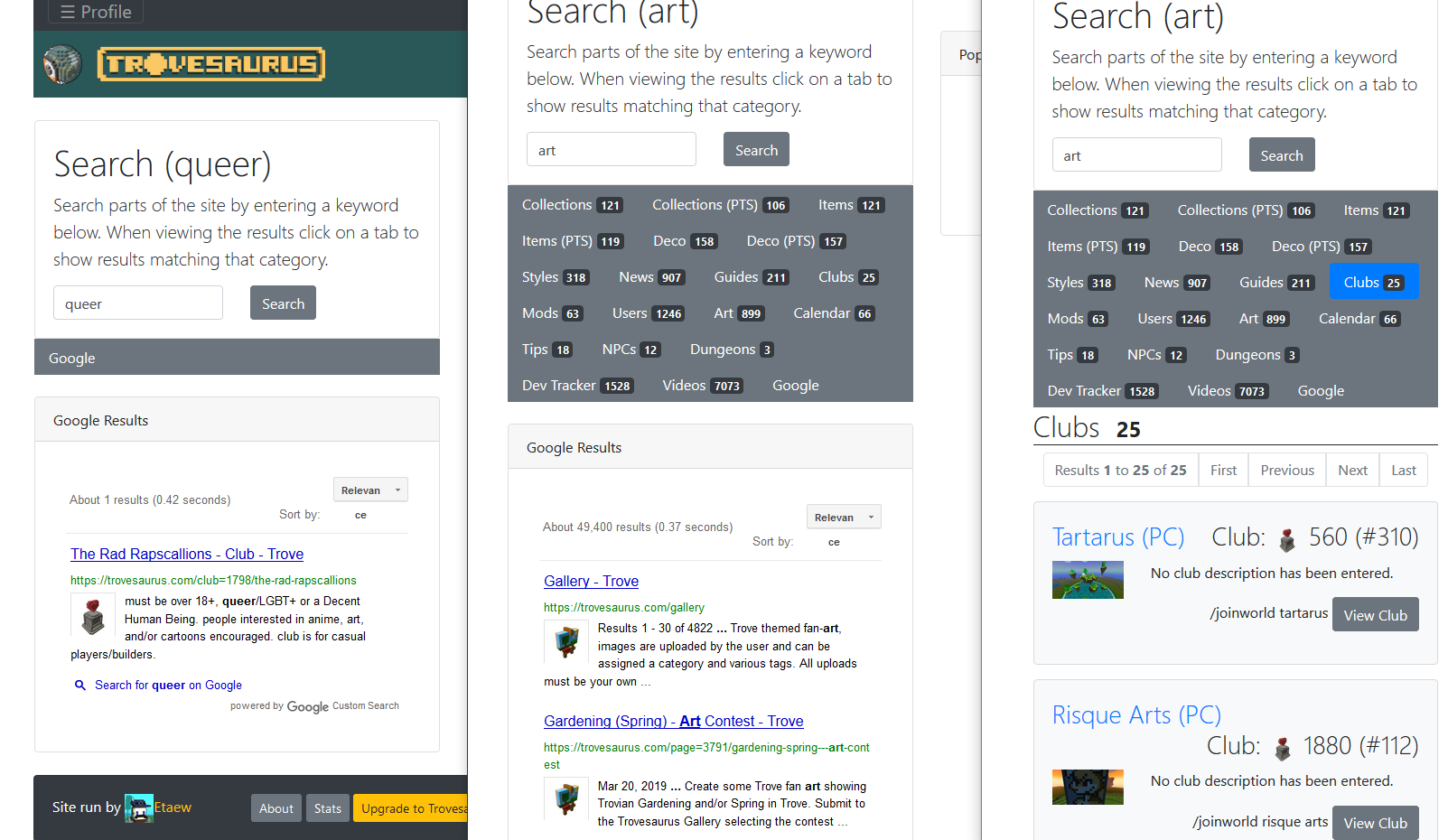
ssorry if this is a bit disorganized, i was looking these things up through the search while writing to double-check, so as not to waste your time.
I think it would be great if we console people could get mods and can you please add more promos for console?
It's not really something I have control over, Dazo needs to become active again.
Still lots of glitches and problems untouched, leaderboards won’t work I wish the problems still here could be fixed, but thank you for the updates on what’s to come and the giveaways are fun even tho I never win any.
It would be nice if it was easier to preview site themes. I was going through all of them and it is a really big pain in the butt to have to click "save", then be taken out of the menu completely just to find out the theme is not something I like at all. Then, I have to go all the way back to edit profile to another menu just to change the theme all over again. Some of the themes are very... strange and make it harder to see stuff on the website at all. For example, one of the themes my friend was using made mods on user profiles transparent and very hard to look at, even though he liked the colors it came with. I suggest either a complete overhaul on site themes in general, or allow us to pick the colors and/or font ourselves to make our own combination, instead of sticking with the presets given. I have seen other websites do something similar. I think it would encourage people to customize their site viewing pleasure. Most people just use the default trovesaurus theme, but I think its a shame this feature is hardly used by anyone because its in a hard to find spot and its annoying to check through every single theme.
Sorry if this is not thorough enough, if you need more specific examples let me know! Love the website by the way. It inspired me to start making mods on my own and I always use it to check for trove news first.
Thank you for the feedback, about theme preview you can use the nav menu for your profile at the top-right of the screen and use the Switch Theme option. It should give you an image preview, and when you click it applies instantly and keeps you on the same page.
I agree that some of the themes don't look great, I included a bunch of default bootstrap ones but I primarily design for the main Trovesaurus theme and secondly Dark since a lot of people use it. It would be a little hard to make everything work on every theme and I might pull some of the lesser used ones. If you have some examples of things that doesn't look right I can take a look and see if it's a simple fix.
Thanks for responding! I can't find the theme my friend was using that was looking weird. I didn't know there was a theme changing option on the top right.
I have a solution to what you said: "It would be a little hard to make everything work on every theme".
Allow simple color and/or text font choices so that people can make their "own theme", even if it's just a simple color and font change. That way, everything can work because you're only changing the font and colors. I personally have trouble reading text if it's a specific font so that would be helpful for people like me, or with dyslexia.
Thanks again for your time reading this.
It's a little vague so could you elaborate on how it could be made easier? Do you mean on mobile devices or on desktop?
