Glorious Knight
[Helmet]

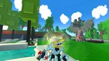

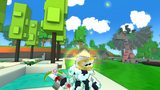


A big helmet of the Glorious Knight, a good guy who protects the people and loves cake. Just ... A nice guy
The first pic is the original helmet
The second and third are with blue shaders, the others are with red shaders (I tried with some colors)
I tried to make a bigger slot in the visor.
Glorious Knight status has been set to Approved
![]() Ylva 5 years ago
Ylva 5 years ago
Glorious Knight status has been set to Needs Review
![]() Alwis 5 years ago
Alwis 5 years ago
Glorious Knight status has been set to Active
![]() Ylva 5 years ago
Ylva 5 years ago
Glorious Knight status has been set to Needs Review
![]() Alwis 5 years ago
Alwis 5 years ago
Glorious Knight status has been set to Active
![]() Ylva 5 years ago
Ylva 5 years ago
Glorious Knight status has been set to Needs Review
![]() Alwis 5 years ago
Alwis 5 years ago
Glorious Knight status has been set to Active
![]() Alwis 5 years ago
Alwis 5 years ago
Glorious Knight status has been set to Needs Review
![]() Alwis 5 years ago
Alwis 5 years ago
You must be logged in to add a comment.
Looking great :D
I like how stylish and simplistic it is, good job! Works nicely in game too, happy to approve :)
Edit: Ps. Files tab requires your .blueprint file named with styletype_stylename[CreatorsName].blueprint . I uploaded one made from your qb files this time around, but for future occasions please make sure you send blueprint and not qbs there :)
Hello again!
Changes looking great, you made the design bulkier but kept triangle-ish shape, well done :) Good job on mapping too, glowing golds give it a bit of a techno vibe :D
I see you also removed black 'background' from visor part? I thought it looked quite mysterious with it, but it looks good without it as well! Although if you prefer it this way, id suggest to make gap for the eyes a bit wider/cleaner. I understand its not the way real-life helmets work but small visor without black to highlight it looks rather busy in game and doesnt read all too well, especially with headless style.

You did very nice shading, but overall helmet still feels as if it only uses two colors. It is not a bad thing in this case id say, but may be it will work better if shadows were more contrast (more visual difference between brightest and darkest) or if there was a splash of color in them instead of just black/white? This is optional though, if you feel like it looks best with the colors it already has, so be it :)
Back to Active for a tiny bit, hoping to see slightly more convincing visor on next review.
Hello!
Sorry for the delay.
Good job on the helmet, looks very knight-ish! I like the unusual shape and overall design, it makes your helmet stand out nicely from default knight class helmets :)
I think with a bit more love it could really shine!
My biggest concern at the moment are all those spikey separated voxels placed in diagonals, they look quite disconnected and messy, both gold and white. Some of them are corner-connected too, and that is not something i would be allowed to approve.
It could be really good if you bulked up that sharp front part a bit, Trove style is mostly square. This guide could be helpful on the matter: https://trovesaurus.com/page=3976/trove-style-guidelines-for-trove-creations
I see you did some shading too, very nice! Shadows really do add depth and volume to models. May be if 'visor' part was noticeably brighter than the rest of the helmet it would look even nicer? Also, gold outline could use some darker bits/highlights as well.
Another thing, its best to keep all the holes in the model filled. At the moment bottom of the chin is far from being flat and tidy and golden ribbon has a gap around the neck.
Last but not least, since knight helmets are usually metal, i think it could be good to use some Material maps on this one. Metal for white and Iridescent for gold bits may be?
I made a quick edit based on your model and suggestions above, its far from perfect and only meant to hopefully give you a direction/inspiration for improvements :) Left is your design with troublesome bits highlighted, right is my edited version, with less spikes and bulkier parts. I do think shading can be done better and im not proud of the top i did either, but im sure you can make a much better one!

Going to set status of this one to Active, send it back to Review if you upload any changes.
heey >:3 id suggest using more colors than 3, i mean try shading it making depth to things makes them less "2d" and the other thing i noticed, try to avoid these "floating" voxels
but im sure ylva will help u out to improve :p (is just mee lurking around)