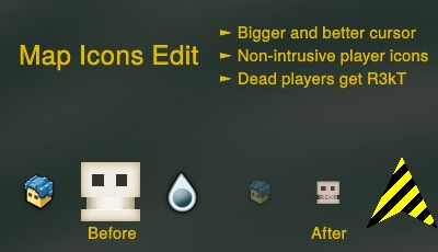
v2.0 changes
- smaller dead player icons
- changed cursor
You must be logged in to add a comment.
It's neat and all, but the player arrow is a bit off - it's almost an equilateral triangle, e.g. you can't easily tell which way you're facing. I used it in an hourly chall, and had to check the compass. =)
Maybe if the arrow would be more like a isosceles triangle, and had a different color on the tip - then it would be much easier to use.
Changes map icons
Created: August 10, 2018
Type: TMOD
Originality: ![]() Inspired Work
Inspired Work
Trovesaurus Views: 5,901
Steam Workshop Views: 0
Downloads: 412
This idea or design of this mod has been inspired by something else.
Credits: Me
Visible on TroveTools