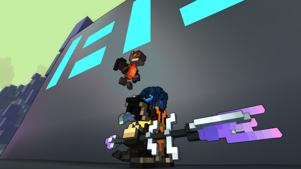
Soulcursed Warden Staff
[Staff] [Cursed Vale]


First you thought that this was a normal stick but the second you touched it you were a soulless Body and forever trapped in a dark void.
Progress
Status
Created 5 years ago
Updated 3 years ago
The author of this Creation has been Rewarded by the Trove Developers.
Soulcursed Warden Staff status has been set to Added
![]() Ylva 3 years ago
Ylva 3 years ago
Soulcursed Warden Staff status has been set to Rewarded
![]() ActualPostCard 4 years ago
ActualPostCard 4 years ago
Soulcursed Warden Staff status has been set to Accepted
![]() ActualPostCard 4 years ago
ActualPostCard 4 years ago
Soulcursed Warden Staff status has been set to Approved
![]() Ylva 5 years ago
Ylva 5 years ago
Soulcursed Warden Staff status has been set to Needs Review
![]() Exootex 5 years ago
Exootex 5 years ago
Soulcursed Warden Staff status has been set to Active
![]() Exootex 5 years ago
Exootex 5 years ago
Soulcursed Warden Staff status has been set to Needs Review
![]() Exootex 5 years ago
Exootex 5 years ago
Soulcursed Warden Staff status has been set to Active
![]() Ylva 5 years ago
Ylva 5 years ago
Soulcursed Warden Staff status has been set to Needs Review
![]() Exootex 5 years ago
Exootex 5 years ago
You must be logged in to add a comment.
Congratulations! Your creation has been added to Trove - ![]() Soulcursed Warden!
Soulcursed Warden!
It can be found in collections under Styles > Staves > Undead.
Hello again!
Staff looks great, loving the usage of glass, it adds some special magic to the design :)
Thank you for fixing them maps too!
Happy to approve, hoping to see more creations from you :D
P.s. Thank you for uploading the blueprint! For future occasions please keep in mind that it should be named styletype_stylename[CreatorsName].blueprint to match Trove naming system, so in your case staff_soulcursed_warden[Exootex].blueprint . I renamed it for you this time around, dont worry :)
@![]() Ylva
Ylva
Thanks for your quick answer your Ideas were really great
so I tried to kinda impliment it to my creation hope you like it ˃ᆺ˂
Also do you think a design (for a dungeon) like this would work out?
https://share-your-photo.com/a0d099c0ee
Kind Regards
Hello and welcome!
What a good looking staff :D I like clean and elegant shape, very well done on soft pastel purples too! (it looks a bit too long on the screenshot but Troxel link has updated version)
Have you tried Material Maps? With them its possible to make voxels glow or shine like metal. Materials can really make the design look refined.
You seem to have a stray colored voxel, is it meant to be darker than one on upper side of same detail?

Also, it could be good to introduce another shade or two of purple in the end part of the staff, so it has stronger visual relation to the front. As another random thought, may be some more of those metal braces along the shaft could make staff look more dangerous? Im not convinced that would work all too well though.
I made a quick edit just to show what i have in mind, more or less. You do not need to copy it in any case, but i hope it could help you pick a direction for adjustments :)

Going to set status of your creation to Active, change it back to Needs Review if you upload updated model. If you d rather create something completely new, set status of this one to Draft, that will free up a creation slot for another style.
In any case, good luck!