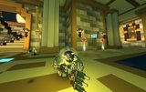
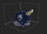
Narwhal
[Helmet] [Animal Head]


"What is the horn for? Idk"
-Albert Einstein
Progress
Status
Created 5 years ago
Updated 2 years ago
The author of this Creation has been Rewarded by the Trove Developers.
Narwhal status has been set to Added
![]() _FutureHero_ 2 years ago
_FutureHero_ 2 years ago
Narwhal status has been set to Rewarded
![]() ActualPostCard 3 years ago
ActualPostCard 3 years ago
Narwhal status has been set to Accepted
![]() ActualPostCard 3 years ago
ActualPostCard 3 years ago
Narwhal status has been set to Approved
![]() Ylva 5 years ago
Ylva 5 years ago
Narwhal status has been set to Needs Review
![]() Sergetoo 5 years ago
Sergetoo 5 years ago
Narwhal status has been set to Active
![]() Ylva 5 years ago
Ylva 5 years ago
Narwhal status has been set to Needs Review
![]() Sergetoo 5 years ago
Sergetoo 5 years ago
Narwhal status has been set to Active
![]() Ylva 5 years ago
Ylva 5 years ago
Narwhal status has been set to Needs Review
![]() Sergetoo 5 years ago
Sergetoo 5 years ago
Narwhal status has been set to Active
![]() Ylva 5 years ago
Ylva 5 years ago
Narwhal status has been set to Needs Review
![]() Sergetoo 5 years ago
Sergetoo 5 years ago
Narwhal status has been set to Active
![]() Ylva 5 years ago
Ylva 5 years ago
Narwhal status has been set to Needs Review
![]() Sergetoo 5 years ago
Sergetoo 5 years ago
You must be logged in to add a comment.
Congratulations! Your creation has been added to Trove - ![]() Sea Unicorn !
Sea Unicorn !
It can be found in collections under Styles > Hats > Stash Exclusive.
Hello again!
Looking good! Thank you so much for introducing more color, now this narwhal really stands out :) Good job on the horn too, its long and yet it fits!
Coloring seems to be rather chaotic on the face part, left side has significantly less than right, but i guess it could be good to have a non symmetrical pattern.
Going to Approve this one :)
It fits in the box now, sweet!
But it looks like that was achieved with cutting off the horn? Thought you wanted to keep that longer? Also did the helmet lose some color? I have a feeling it used to be whiter on the bottom.
You have that whole space on front, back and sides that could be reduced and so a longer horn would fit.
 Im not here to try and make obstacles in your way of getting items in game, im trying to help and get them to their most attractive and presentable shape. Its not that hard to bypass me, but after that you still need to impress Devs. If you truly believe this one is good to go, sure thing i can approve it since it now works fine from technical point of view and it is rather cute model overall :D
Although i do strongly suggest to try to shrink it down a bit, return back the colors (and may be try that dark blue instead of grey) and return some length to that horn. If you d rather keep it as is, set it back to review without changes :)
Leaving it up to you :P
Right, i think we are talking about different thing here, i ll try to explain.
Template is meant as maximum distance in voxels to each side from Attachment point, so its a cube around players head. You cant get more voxels on one side if you reduce them on the other side.
Total size of your model and template does match (top image, view from above), while if we look from the bottom the APs are not placed in same location (bottom image, view from below).

If we try to match aps, your design goes too far in the front.

Whole design has to fit in provided dimensions around the head/around the attachment point.
If you try to achieve that, you might aswell need to reduce the overall size of the head so it all fits in the box.
You did great job on rounding up the bottom side, it looks much better now!
Back to Atcive to get those dimensions straight.
Hello again!
Yellow on the horn looks better! AP also looks centered now, well done :)
However it seems model itself became even longer and the front of it is even bigger/heavier than it was? Im sorry, i cant approve something that exceeds template dimensions >_<

Have to set you back to Active with same feedback as first time :(
Hello!
Narwhal looks good! I very much like the way you did the coloring, its contrast and naturally-random but also brushed and consistent, good job :D
For the contest this helmet works nicely, but if you wish to get it approved and hopefully accepted by dev team there are some things that need to be adjusted.
First, please check the location of attachment point. In game helmet looks dislocated. It is also of quite a big size, that sadly does not fit in the dimensions. Plus it looks a bit off on classes that dont have such big shoulders as revenant.
Image below you can see the grey outline of helmet template, and pink outline of your design if i try to match the space for players head (since the AP is misplaced).

By misplaced AP and hanging sides i mean this:

Could you please fix those?
Another thing, at the moment helmet is very monochromatic. While that is a proper representation of real-life colors, it could be good to introduce just a slight hint of color to it. Trove is cartoonish and colorful, and its better to brighten things up if there is a possibility of that.
I made a quick edit based on those suggestions, smaller shape, fits in template, slightly more dark blue on black parts and light-brown on the horn. It is still far from perfect and you dont have to copy it, just hoping it could help you pick a direction for edits :)

Changing status back to Active for now, set it back to Review if you upload any changes :)