Hey there! Some thoughts before starting your creation
Trove is a game that attempts to embrace a colorful, cartoony feel first and voxels second. This means that we want to focus heavily on the style of Trove above trying to make a specific item with voxels. You’ll want to break down shapes into simple squares and straight lines focusing on good color usage above trying to mimic something in real life. Trove is silly, fun, bright, and compelling. Try to keep these things in mind when creating your piece. Have an open mind.
Recreating style and how to use shapes to make it "Trove"
With a lot of people making their first creations I see a lot of attempts to be as organic as possible. Often, creators will try to make rounded objects or curvy lines and these simply don’t translate well in voxels and even more important, is not on track with Trove’s style. What we want is to break down organic elements into box shapes. Removing organic information and creating a caricature of that object much like a cartoonist removing extra visual data to create an abstract style.
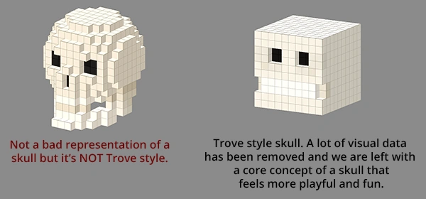
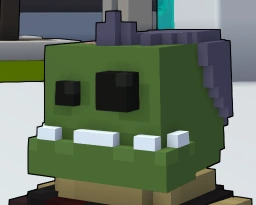
This information is very important to keep in mind when creating objects for Trove especially organic ones. Any place where you may try to imply a rounded or fluid shape; take a moment to re-think how it may be made in a boxy way. A good example is this zombie helmet. Everything is boxy but it still has a lot of character. Always be thinking in fun concepts, straight lines, and mostly solid colors with Trove.
Colors and shading
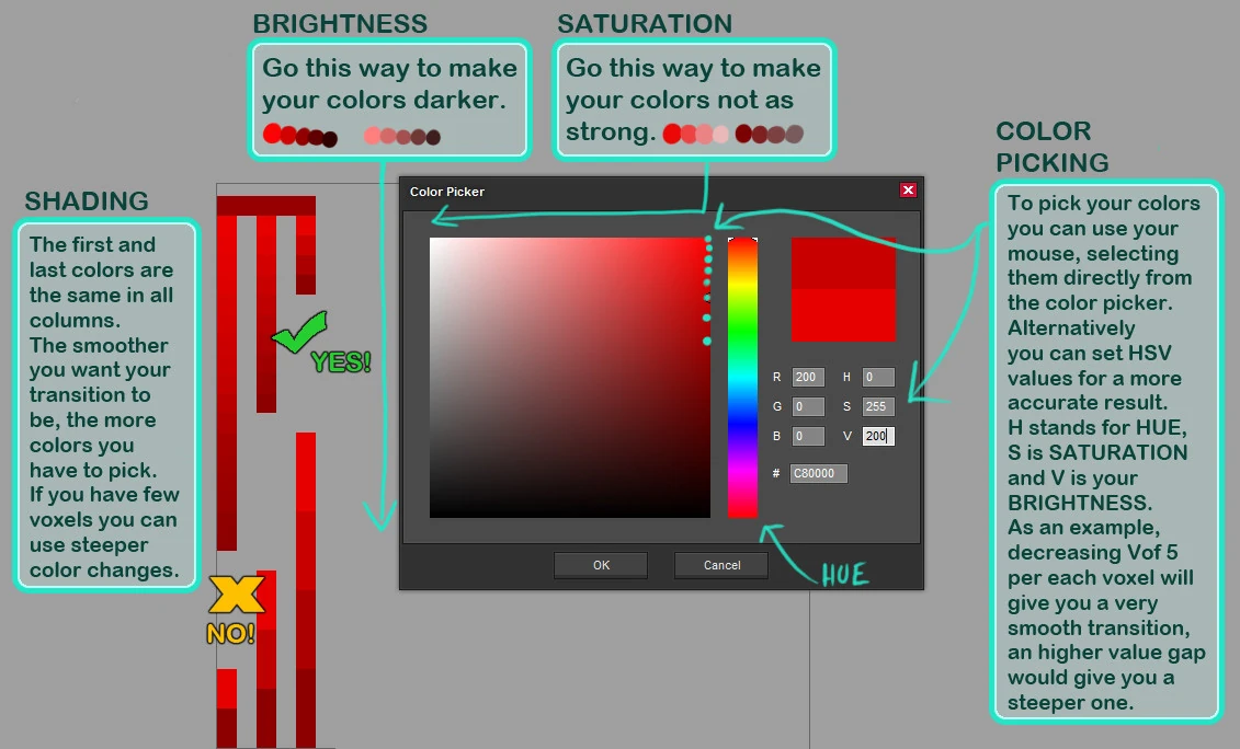
When picking your colors and deciding how to lay out your choices onto your piece, keep in mind that solid colors work best in our engine. There is plenty of lighting and cool material types to give your piece the look you want so try to avoid painting specular shine or other lighting directly into your piece. If you do want to imply some ambient shadow to give the piece some depth, that’s fine, but be sure that any gradient you use is smooth and subtle. We don’t want to see gradients that look chunky or have abrupt transitions into the rest of the piece.
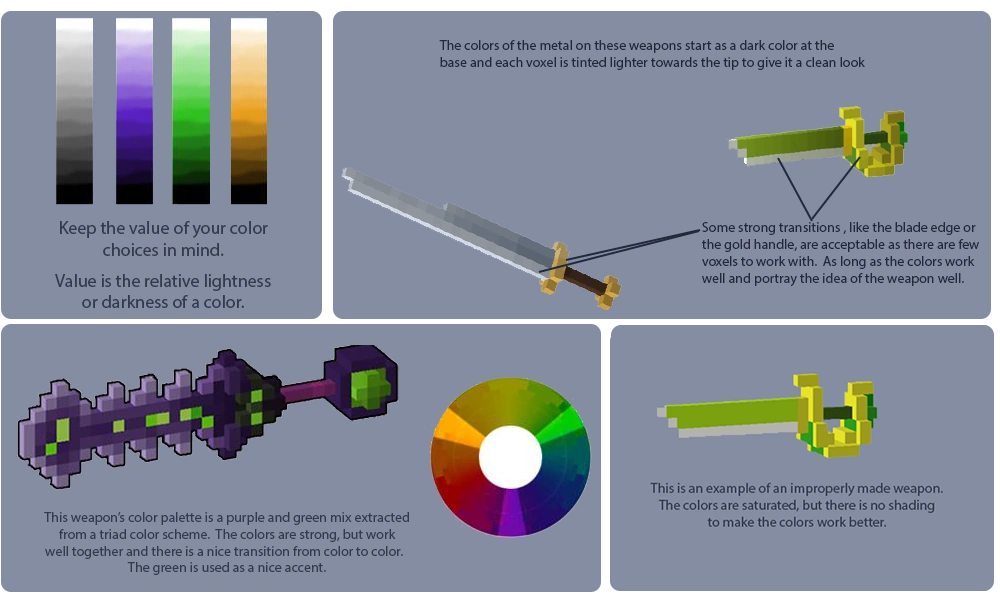
Attachment points/handles
Items know where to attach to the player through a voxel on the asset being a specific color. This is called the attachment point. Wherever this attachment point is, is where it will attach to the player (eg. Hand if a weapon or head if a hat, hairstyle or mask.
The attachment point is a single voxel that is RGB 255, 0, 255 (#FF00FF). This point should be surrounded by a three by three cubic area that is devoid of other voxels except as required by the "handle". There must be no other voxels that are the same color.
Keep your ideas yours
over time, I have seen a lot of items that are basically just voxel versions of another concept from a different IP (intellectual property). While it is ok for SOME inspiration from existing ideas, we want to avoid an exact replica of other work (mostly because it simply doesn't mesh with the concept of Trove's direction). Use creating an item for trove as a chance for your creative juices to create something original and compelling. There are cases where inspiration from other areas is fine. Here's what I mean.
GOOD use of inspiration from an existing IP
- "I love mega man, so I created a gunslinger gun that is a hand cannon!"
BAD use of inspiration from an existing IP
- "I love mega man, so I made a mask that is mega man's face!"
The key difference here is that the good example is simply using a concept that is inspired from mega man. The bad example is just blatantly using mega man (which we want to avoid) Try to keep this concept in mind when you create items. If your item IS another item from another game or idea, your creation will most likely get rejected.
Additional Helpful Hints
Full Black
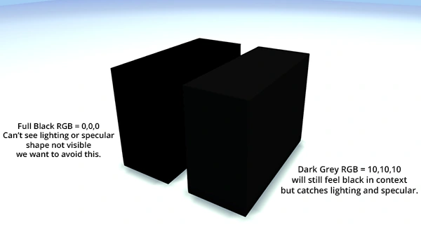
Many creators want to use black. We know it's cool, but the issue with black in game vs real life is that black in game tends to not show lighting making your piece lose its shape. Instead, what we want is a very dark grey that appears in game to be a black object that still takes light. In order to do this, you will want to avoid an RGB value of 0,0,0 (which is full black)
Instead, you shouldn't go any darker than an RGB value of 10,10,10
Shading
Ideally you want your shading to be as smooth as possible. See the comparison image below where the item on top has strong contrast noise and the one below has the same noise, but with much less contrast, and therefore it doesn't detract from the design.

Voxel Placement
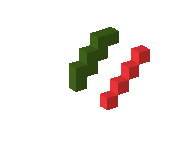
When you are making your design, be mindful of how the voxels are "connected". Overall using voxels that are disconnected, but in close proximity is poor format. Look at the image below for an example of how you could correct an angular segment that uses the disconnected voxels. The red blocks are in the improper format and the green blocks are the corrected ones.
Using Text
Using text in your designs is NOT permitted.
I like them. The OUCH spanker may not work though since it has english on it. While we aren't certain what we are doing as far as other languages, if we ever need to translate the game, writing on a weapon would bring a lot of issues.
Archived text from http://www.reddit.com/r/Trove/comments/1uilul/item_submission_by_kungfuquickness_1/ceihs7f
