DrownFish
[Melee] [Treasure Isles]
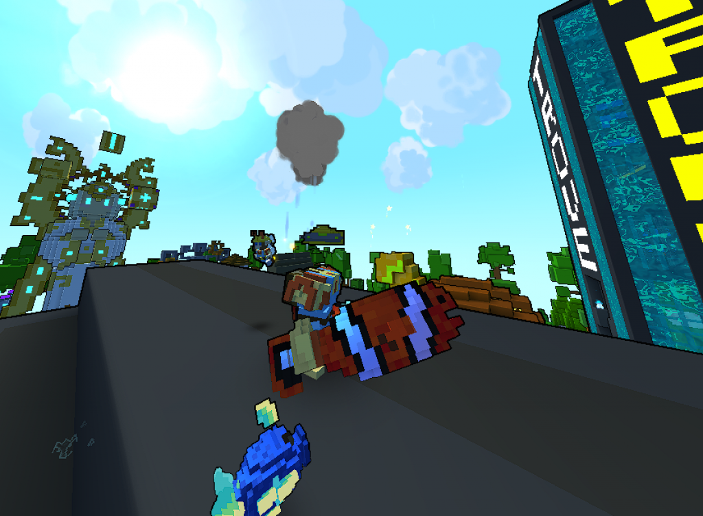
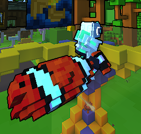
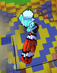
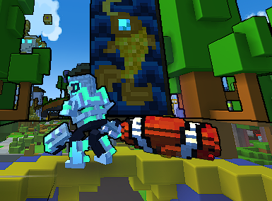
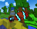
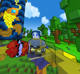
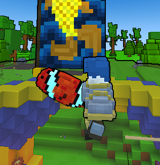
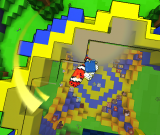
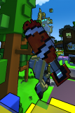
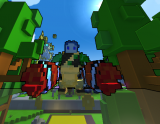

Clownfish from water catch it, keep it but don't eat it.
Progress
Status
Created 11 months ago
Updated 10 months ago
The author of this Creation has been Rewarded by the Trove Developers.
DrownFish status has been set to Added
![]() Ylva 10 months ago
Ylva 10 months ago
DrownFish status has been set to Rewarded
![]() ActualPostCard 10 months ago
ActualPostCard 10 months ago
DrownFish status has been set to Accepted
![]() ActualPostCard 10 months ago
ActualPostCard 10 months ago
DrownFish status has been set to Approved
![]() Ylva 11 months ago
Ylva 11 months ago
DrownFish status has been set to Needs Review
![]() MMIyt 11 months ago
MMIyt 11 months ago
DrownFish status has been set to Active
![]() Ylva 11 months ago
Ylva 11 months ago
You must be logged in to add a comment.
Congratulations! Your creation has been added to Trove - ![]() Drown Fish !
Drown Fish !
It can be found in collections under Styles > Melee > Treasure Isles.
Have you been using a /weaponpreview function to view the belueprint in game or the Override folder?
Having your blueprint in either override or as a mod would make you see your design instead of a sword that you chose to replace.
For example, if you name your sword blueprint equipment_weapon_1h_sword_001.blueprint and put it in the Trove/Live/blueprints/override - you will see your model replace the Chipped Sword in game. All the other players will still see the Chipped Sword as it is - unless they download the same override file.
Same works for any other sword.
You could make a .tmod (Trove Mod file) out of your sword if you want an option to enable/disable its visuals through Mods menu - check step 10 here > https://trovesaurus.com/mods/learn .
I hope this helps!
The fish looks glorious with the new colors! Approved.
To answer your questions:
1) For the catalog - https://trovesaurus.com/page=2340 - make a bat (type text in the .txt and save as .bat), drop it in your Trove/Live, run and input blueprint name or partial name. The more blueprints match the criteria the longer it will take to run, but once its done you should see the image(s) in your Trove/Live/catalog.
You dont have to make catalog images for creations, its something moderators do when creation gets Approved.
2) Gun is 5x5x12 pointing down - https://i.imgur.com/pFn3uFG.png . Some not very nice person removed page on the wiki. We will eventually have our own Trovesaurus hosted pages for all guides.
3) Sword are 10x10x35, with an extra voxel being UP and OUT from a player position, but going for 9x9x35 is usually easier and works better - https://i.imgur.com/uuSCWUf.png
4) Im not quite sure what you mean by 'is there is any way to play with it'.
Hello o/
What a great idea for a sword, i love it. Good job on the Material maps too!
Everything seem to be correct from a technical side, but i have a couple of color-related suggestions that i believe might help to sell the concept.
Currently there are quite a few shades of orange color, but they are very hard to see - it feels as if the whole fish had just one Orange, one white and one black color. If some of those Orange colors were closer to Red and some others closer to Yellow - it would be easier to tell them apart and so tell the difference between the back and the belly of the fish.
Also, it might be worth it to simplify the shape of the head. Blocky shapes tend to work better in Trove. A bit more volume (of orange voxels) around the eye would help with separating it from the black stripe.
Quick edit to show what i mean:

Im going to change the status of this creation to Active for now, but hoping to see it back on Review!