Progress
Status
Created 2 years ago
Updated 1 year ago
The author of this Creation has been Rewarded by the Trove Developers.
Clever Girl status has been set to Added
![]() Ylva 1 year ago
Ylva 1 year ago
Clever Girl status has been set to Rewarded
![]() ActualPostCard 2 years ago
ActualPostCard 2 years ago
Clever Girl status has been set to Accepted
![]() ActualPostCard 2 years ago
ActualPostCard 2 years ago
Clever Girl status has been set to Approved
![]() Ylva 2 years ago
Ylva 2 years ago
Clever Girl status has been set to Needs Review
![]() GooberBalls 2 years ago
GooberBalls 2 years ago
Clever Girl status has been set to Active
![]() Ylva 2 years ago
Ylva 2 years ago
Clever Girl status has been set to Needs Review
![]() GooberBalls 2 years ago
GooberBalls 2 years ago
Clever Girl status has been set to Active
![]() Ylva 2 years ago
Ylva 2 years ago
Clever Girl status has been set to Approved
![]() Ylva 2 years ago
Ylva 2 years ago
Clever Girl status has been set to Needs Review
![]() GooberBalls 2 years ago
GooberBalls 2 years ago
Clever Girl status has been set to Active
![]() GooberBalls 2 years ago
GooberBalls 2 years ago
Clever Girl status has been set to Draft
![]() GooberBalls 2 years ago
GooberBalls 2 years ago
You must be logged in to add a comment.
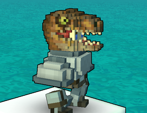
Congratulations! Your creation has been added to Trove - ![]() Clever Clawdia!
Clever Clawdia!
It can be found in collections under Styles > Hats > Stash Exclusive.
@![]() Ylva
Ylva
Hey, i really dont think i have any specific advice on exact details of dinosaurs >_< Your goal there seems to be make them as accurate to the source as possible, while developer-made Trove graphics tend to be more simplistic and colorful rather than trying to be an exact representation of something.
I believe the design would be more 'trove style' if the shading and coloring were more simple. Like, the ![]() Racing Raptor is also a very clever girl, but the difference between it and your model is enormous. The Spinosaurus that got in game is also on simpler side, compared to this design. Sometimes less is more.
Racing Raptor is also a very clever girl, but the difference between it and your model is enormous. The Spinosaurus that got in game is also on simpler side, compared to this design. Sometimes less is more.
Please forgive this edit, i fully understand that every colored voxel has a meaning. I just mean it as something that is simple but hopefully carries over the same general idea.

That said, i dont think its a bad thing to keep textures on this helmet as is, we have had the player-made creations pushing the in-game graphics towards the "more detailed" direction for years now.
As for the shape, the new skull definitely makes it look more "raptor" and i love the new eyes and the jaw!
A super minor note: the upper part of some teeth on both sides of the upper jaw are missing metallic map. It is not that noticeable in game though.

Your works are visually appealing as is! You dont have to make any changes to the helmet unless you want to.
I can try to help you make things more in line with dev-made graphics, but only you can help you make it the best possible version of itself :) From where i stand the helmet was good to be approved on version 1 and is still good to be approved on version 6.
@![]() Ylva
Ylva


