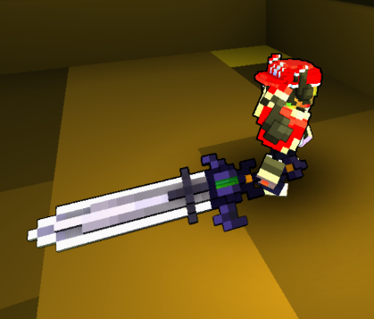
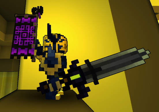
Timesworn Relic
[Melee] [Cursed Vale]


"Though its power wanes, this winged relic still offers far more oomph to any Knight's charge than your average armament."
Timesworn Relic status has been set to Approved
![]() Ylva 3 years ago
Ylva 3 years ago
Timesworn Relic status has been set to Needs Review
![]() Pyrodisc 3 years ago
Pyrodisc 3 years ago
Timesworn Relic status has been set to Active
![]() Ylva 3 years ago
Ylva 3 years ago
Timesworn Relic status has been set to Needs Review
![]() Pyrodisc 3 years ago
Pyrodisc 3 years ago
You must be logged in to add a comment.
Ah i see, yeah, that all makes perfect sense :) Thanks for updating the model!
Approved.
Also, thank you for uploading the blueprint. The naming on those needs to follow a pattern of styletype_stylename[CreatorsName].bluperint, so each of them would have a unique identifier. In your case that would be sowrd_timesworn_relic[Pyrodisc].blueprint . Naming like equipment_weapon_1h_sword_timesworn[Pyrodisc].blueprint works just as fine, as long as there is an indicator of what type is it, the name of the style and the Creators Name in square brackets. Dont worry, i renamed your file and everything is in order, just thought i d mention this for future occasions :)
@![]() Ylva
Ylva
Hello!
What a beautiful claymore you ve go there :) With all our 950+ melee styles in game, i dont think we have anything quite like this one. Some styles come close in shape, but none share the shape and the theme, good job!
I have to ask a couple of thing before clicking that Approve button:
Are the top and bottom elements supposed to be different? The ones in green rectangles. And that voxel on the very end of the middle line, is it meant to have different color? On the other side of the sword the whole line is the same.

Also, i had to check the amount of colors used with the QB color tool since its not a good thing to use gradient/noise and have ~100 voxels each of different color, and things look quite alright from that perspective. But there is also a whole bunch of bright purple colors that came up. Its usually best to keep the models clean on the inside and outside, so it would be great if you could flood-fill all those with a single color.

Im going to change the status of your creation to Active for now. Set it back to Needs Review if you upload changes to the model. If it is exactly the way its meant to be - send it back to review as is.
If you would rather create something completely different - set the status of this one to Draft, it will free up a Creation Slot for something else.
In any case, good luck!