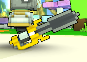
Connected Blade
[Melee] [Medieval Highlands]


"Remember how I absolutely pwn'd you on the Cursed Skylands?"
Connected Blade status has been set to Draft
![]() TheGunBlaster 3 years ago
TheGunBlaster 3 years ago
Connected Blade status has been set to Active
![]() Ylva 3 years ago
Ylva 3 years ago
Connected Blade status has been set to Needs Review
![]() TheGunBlaster 3 years ago
TheGunBlaster 3 years ago
Connected Blade status has been set to Active
![]() Ylva 3 years ago
Ylva 3 years ago
Connected Blade status has been set to Needs Review
![]() TheGunBlaster 3 years ago
TheGunBlaster 3 years ago
You must be logged in to add a comment.
Ah, i havnt played Roblox so wouldnt have a clue about origins of their assets :) Looking at that sword you linked though, your model does look quite different from that design, which is a good thing.
Makes me wonder if other yellow+bluestleel swords that we have are referencing the same thing haha.
@![]() Ylva
Ylva
Friendly reminder that the Linked Sword model doesn't actually belong to ROBLOX. Infact, it's origin dates back to TurboSquid (by shutterstock).
Also, I tried changing up the shape a bit overtime to avoid the copyright.
https://www.turbosquid.com/3d-models/maya-sword/160669
I appreciate you mentioning that! We cant really have direct references to other IPs though, if it looks too close to the original design they could sue Trove for using their assets >_< Im aware we have some referencing designs in game, but every case was carefully reviewed by the Dev team.
@![]() Ylva
Ylva
I respect your advice about changing it's overall weapon type, but I'm trying to mirror the look of the Linked Sword from ROBLOX. Hence the color palette.
Hello!
Ah i see why is your glow is not working.
The material maps can not overlap, if you have one voxel mapped Glowing (255.0.0 RGB) on Type it cant be anything BUT Rough (128.0.0 RGB) on Specular. The game can not render things like Glowing Metal or Iridescent Glass etc.
In the most left column there are current material maps. You can see the overlapping maps on the white gem.
(Side note, if you are not using map you dont need to create it. Meaning, you have no blocks mapped Glass/Glowing Glass/Tiled Glass on Type so you do not need to include a blank Alpha map. Same works for others, if you dont have any glowing or glass blocks on Type - you dont need to include that, and if you dont have any metal etc - no Specular map is needed either.)
Back to the mapping though! Second and third columns show sets of Maps that would work.
In the middle one you can see i kept Iridescent mapping on Specular, but the Type map is blank.
In the most right column i kept Glowing on Type, but those two voxels on Specular are now Rough.
Red X marks maps that you dont need to include in those variations. (Edit: meaning you dont need to create separate qb files for them before converting main qb to blueprint. If the map does not exist it counts as not specified.)

Meaning, if you want that gem to glow you would need to use mapping from the most right column.
Metal on the rest of the blade seems to be working just fine. It might not be that noticeable because the whole thing is metal. You can see change in shine if you put a model without full-metal Specular map coloring next to the design.

As for the design itself, i can most definitely see an improvement. Coloring looks so much better and cleaner, good job! Shape is looking more interesting too.
However, it feels like now its getting pretty close to ![]() Cobalt-Edged Cutlass .
Cobalt-Edged Cutlass .
It can be really hard to create a brand new design for a sword with all the variety that we have already :(
In the past ~4 years we only had 3 player-made swords added to the game (im not counting ones that came with costumes). I strongly suggest you try to turn it into an Axe/Hammer/Mace/Club/something that is not obviously a sword, i believe you would have much higher chances to get it in game that way.
Most important part is fixing the maps though. Once they work properly you could send the sword back to review. If it is unique enough i should be able to approve it, even if its still a sword :)
Hm, if maps are done properly they should show on weaponpreview. Im sorry, there isnt much help i can offer without seeing the model/blueprint.
We should be able to figure it out if you upload a blueprint+troxel and set creation for Review.
@![]() Ylva
Ylva
I did preview the weapon in-game, that's where the problem of no metal or glowing resides.
I was using same colors as you have, but placed them by hand where it made sense. It same as with pixel art/any other art - place lighter shades where the light falls on the object and darker shadows where light doesnt reach.
As for glowing and metal - maps in Troxel might not appear all too perfect, checking out something in game is usually a more reliable way. Its hard to tell what might have gone wrong, id suggest uploading a new troxel link together with your blueprint to the Files tab and sending your creation back to Review. It would be easier to figure out.
@![]() Ylva
Ylva
i've added a glowing gem and it wont glow, the sword's blade and gold wont reflect like metal.
any idea why?
@![]() Ylva
Ylva
Could I get a tip on how to do smooth color transitions as shown in the photo?
Hello!
Blade looks quite alright, you most certainly picked the best colors to represent the Cursed Skylands!
That said, there are over 950 various melee designs in game, so all the new swords do need to be super special and well designed to offer something new to the players. You could check out all existing melee designs over here > https://trovesaurus.com/styles/Melee%20Weapon . For comparison, there are only about 500 bows and 200 fist styles.
I think the design that comes closest to yours is the ![]() Lavish Lord's Sword, so there is some room to possibly get it in game, but it would need to stand out a bit more. Do you think it would be possible to turn it into a good looking axe or other sort of melee weapon?
Lavish Lord's Sword, so there is some room to possibly get it in game, but it would need to stand out a bit more. Do you think it would be possible to turn it into a good looking axe or other sort of melee weapon?
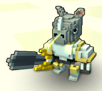
Another thing, it is important to keep an eye on how does the model behave when equipped. On your own screenshot you can see that the top part of hand guard is placed IN the shoulder of a knight. If you made that smaller or moved it closer to the front it would likely behave better.
Also, it seems like there are too many different color shades used. This usually happens when people use Noise - automatic coloring that some voxel editors offer. The way Trove renders things is that every block of different color is considered a separate piece, while multiple blocks of same color (even a big group) are counted as one. This is the same reason why we are not allowed to have floating and corner connected voxels. Worst thing about this is that while it is using game resources to render - this color variation is barely noticeable to the naked eye. So while your sword has a 59 different shades, it appears to use only 6 - gold, blue, 2 shades of silver and 2 shades of blue steel.

You can always check your model yourself if you upload the QB to here > https://trovesaurus.com/colours .
There are quite some old styles that do use Noise, but it is exactly because of them that we are not allowed to use it anymore.
Doing coloring by hand usually results in cleaner textures that fit the Trove style much better.
59 colors VS 12 colors used, for example:

To sum up that wall of text - the design looks good, but it would need some more love and care to really shine and offer something new to the players.
Im going to change status of your creation to Active for now, set it back to Needs Review once you upload an updated model. If you would rather create something completely different - you could change the status of this one to Draft. That will hide it from the public list and will free up a slot for another creation.
In any case, good luck!