Arcadian bow status has been set to Active
![]() Ylva 5 years ago
Ylva 5 years ago
Arcadian bow status has been set to Needs Review
![]() Tarlyn 5 years ago
Tarlyn 5 years ago
Arcadian bow status has been set to Active
![]() Ylva 5 years ago
Ylva 5 years ago
Arcadian bow status has been set to Needs Review
![]() Tarlyn 5 years ago
Tarlyn 5 years ago
Arcadian bow status has been set to Active
![]() Tarlyn 5 years ago
Tarlyn 5 years ago
Arcadian bow status has been set to Needs Review
![]() Tarlyn 5 years ago
Tarlyn 5 years ago
You must be logged in to add a comment.
Hello again!
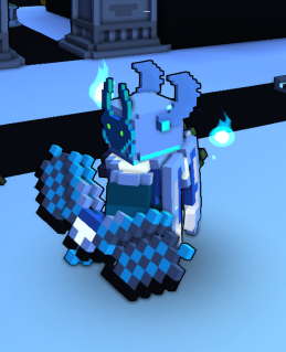
Changes look interesting, i like how the bow front and back are much less identical :)
Circular elements look good, but im starting to worry it might come too close to ![]() Chiropteran Captor model. Not saying it is, but it feels like its moving towards that design.
Chiropteran Captor model. Not saying it is, but it feels like its moving towards that design.
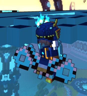
You think it would be possible to reduce the amount of diagonal elements? (red lines on white voxels) Even a slight alteration (light green line on grey voxels) makes element much more convincing and refined.

The part in the red circle would have to go. There are indeed some bow models in game that have it, but they got in game before this rule became mandatory. In Bow Creation guide you can see an explanation:
>> Bows will be split in half at the pink connection point by code once in game for animation purposes. For example, if you put a small shield on the front of your bow, it will be split in half once in game and may not look as desired when animated. <<

Last but not least, i do strongly suggest you try Material Maps. They can be used to make voxels shine like metal or glow, and Neon is all about glowing :P
Changing status to Active for now, send it back to Review if you update the model.
Hello and welcome!
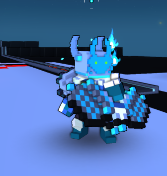
Bow design looks promising, but few things would need to be adjusted before i could Approve it.
First of all, your model contains a lot of corner-connected voxels, those do exist on some old models but they can no longer be parts of the design. When you have model opened in Troxel you could click on Lint and Export button, it will highlight all disconnected parts and show other issues, if there are any.
Another thing, its usually best to avoid chessboard-type patterns. Things get scaled down in Trove and start looking too busy/messy. Current design does have a nice Neon City vibe to it, but may be the pattern can be scaled up a bit? 2x2 for each 'cell' instead of 1x1? Slightly shifting cells could also work nicely. I made a quick edit based on your model and suggestions above and some random ideas. You dont need to copy it in any case, only meant to hopefully help you pick a direction.

Going to set status of your creation to Active, change it back to Needs Review if you upload updated model. If you d rather create something completely new, set status of this one to Draft, that will free up a creation slot for another style.
In any case, good luck!