Progress
Status
Created 5 years ago
Updated 3 years ago
The author of this Creation has been Rewarded by the Trove Developers.
Horse Mask status has been set to Added
![]() ActualPostCard 3 years ago
ActualPostCard 3 years ago
Horse Mask status has been set to Rewarded
![]() ActualPostCard 3 years ago
ActualPostCard 3 years ago
Horse Mask status has been set to Accepted
![]() ActualPostCard 3 years ago
ActualPostCard 3 years ago
Horse Mask status has been set to Approved
![]() Ylva 5 years ago
Ylva 5 years ago
Horse Mask status has been set to Needs Review
![]() MisterY 5 years ago
MisterY 5 years ago
Horse Mask status has been set to Active
![]() Ylva 5 years ago
Ylva 5 years ago
Horse Mask status has been set to Needs Review
![]() MisterY 5 years ago
MisterY 5 years ago
You must be logged in to add a comment.
Congratulations! Your creation has been added to Trove - ![]() Sebastian Superfan!
Sebastian Superfan!
It can be found in collections under Styles > Hats > Stash Exclusive.
Hello!
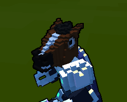
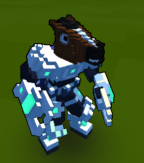
Hah wow xD Love the mask and way its done! Seriously good job.
I am a bit torn with feedback on this one. It looks derpy cute and handsome as is, and adjustments im about to suggest could possibly that that away and make it more realistic :(
With that said, nose part bothers me the most, that 2x3 lowered area in the middle of it. I assume it was done to highlight nostrils? May be some color highlight would work better for that. Another thing, it could be good to separate ears from eye area so they blend in less.
Last thing, they way eyes are now is fun and i like it a lot, but head could look somewhat more cartoonish/trovian if they were 1 voxel lower.
Image to reference what i mean, left is original, right is edited (but this does not mean that edited is completely right :P)
 I am going to set status of this one to Active, but you do not have to make any adjustments you dont want to do. Hoping to see it back on Review, in a way you d find most suitable :)


